What Is Composition in Web Design?
Composition in web design is the arrangement of visual elements, such as text, images, color, and white space, on a page to form a cohesive whole. A well-composed page guides the visitor’s eye toward what matters most, holds attention, and feels balanced and intentional rather than cluttered.
More About Composition
A cohesive composition guides the visitor's eye to a focal point instead of leaving them to scan at random. That's the mechanism behind its business value: a page that steers attention toward its message and its call to action conveys your brand values and drives conversions.
Common principles and tools designers use to compose a page include:
- Grid system. Organize content on a grid so every element aligns with the others instead of floating on its own.
- Visual hierarchy. Rank content by importance, using size, color, and placement to control what viewers read first.
- Typography and color. Bold fonts and strong colors highlight CTAs and draw attention to important information.
- Visual balance. Distribute visual weight so no side of the page feels heavier than the other.
- White space. Empty space around elements gives the focal point room to work and keeps the page from feeling cramped.
- Contrast. Differences in color, size, or weight make key elements stand out from their surroundings.
Composition techniques
The rule of thirds is the most common starting point. Divide the canvas into a 3x3 grid of 9 equal quadrants, then place key elements along the gridlines or at their 4 intersections. Eyes land on the top-left intersection first, which makes it a natural home for a headline or logo. The UX Design Institute's December 2023 guide to the rule of thirds walks through the pattern in detail. The golden ratio (about 1:1.618) is the main alternative grid.
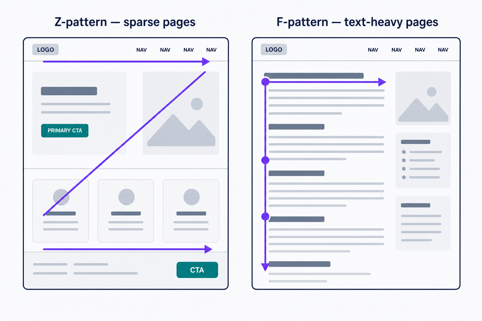
Reading patterns tell you which flow to design for. A Z-pattern suits sparse pages such as landing pages, where visitors scan across the top, diagonally down, then across the bottom. An F-pattern suits text-heavy pages, where readers scan the first lines and then down the left edge. A typical Z-pattern homepage puts the logo top left, the navigation top right, the headline along the top gridline, and the primary CTA at the bottom right, where the Z ends.
Composition vs. layout
Designers often use the terms interchangeably. Uxcel's design composition lesson (updated May 15, 2023) even notes that composition is also called layout. When you need to tell them apart:
- Layout is where things sit: the structural placement of elements on the grid.
- Composition is what that placement adds up to: the balance, flow, and emphasis of the page as a whole.
You can change a composition without moving a single element, for example by swapping colors or font weights, but you can't change the layout without changing the composition. The distinction matters when a page is perfectly aligned yet still looks wrong: that's a composition problem, not a layout problem.
How to improve your page's composition
Work through this sequence in order:
- Pick a single focal point per screen and build everything else around it.
- Align every element to a grid. Anything off the grid should be off deliberately.
- Group related elements so viewers read them as one unit.
- Leave white space around the CTA so it isn't crowded by its neighbors.
- Check balance and contrast: squint at the page, and whatever still stands out is your actual focal point.
- Recheck at mobile widths, where a responsive design restacks columns and focal points move.
Bad composition fails in predictable ways, each with a matching fix:
- Clutter with no clear focal point. Visitors can't find what they came for and leave. Cut or demote anything that doesn't support the page's one job.
- Competing CTAs. Buttons of equal weight split clicks. Keep one primary action per page and style the rest as secondary.
- Inconsistent alignment. Elements that almost line up read as sloppy. Snap them to the grid.
- Cramped spacing. Elements pressed together blur into noise. Add white space until each group stands apart.
Start with your homepage: name its focal point, then run the checklist. For a refresher on the building blocks themselves, see our guide to the basic elements of web design.
Frequently Asked Questions
- No. The rule of thirds divides the canvas into an even 3x3 grid, while the golden ratio (about 1:1.618) places its dividing lines closer to the center. Both are guides for positioning focal points off-center, where the eye lands more naturally than dead center.
- On small screens, multi-column grids collapse into a single column, and focal points restack vertically. A composition that works on desktop can bury the call to action on mobile, so recheck the page at every breakpoint before you ship.
- One per screen. When several elements compete for attention, nothing gets seen first. On long scrolling pages, treat each section as its own screen: give it a single focal point and enough white space to breathe.
Custom Website Design
Get a one-of-a-kind, mobile-friendly website that makes your brand truly shine. Share your vision with us and we'll take it from there.
Custom Web Design