What Is Contrast in Web Design?
In web design, contrast is the visible difference between two or more elements, created with color, size, weight, shape, or spacing. Designers use contrast to draw the eye to key content, build visual hierarchy, and keep text readable. Accessibility guidelines set minimum contrast ratios, such as 4.5:1 between normal text and its background.
More About Contrast
Why contrast matters
Contrast does two jobs. It keeps content readable: visitors with low vision or color blindness can't make out text that blends into its background, which is why the Web Content Accessibility Guidelines (WCAG) set minimum contrast ratios and why every accessibility audit checks them. It also directs attention: the eye lands on the strongest visible difference first, so contrast is how a design points to headings, calls to action, and every other level of its visual hierarchy.
Ways to create contrast
Color does the heaviest lifting: light text on a dark background, or dark text on light. That can be as simple as laying white text over a darkened hero image, the way a banner overlays its headline on a photo. Color isn't the only tool, though:
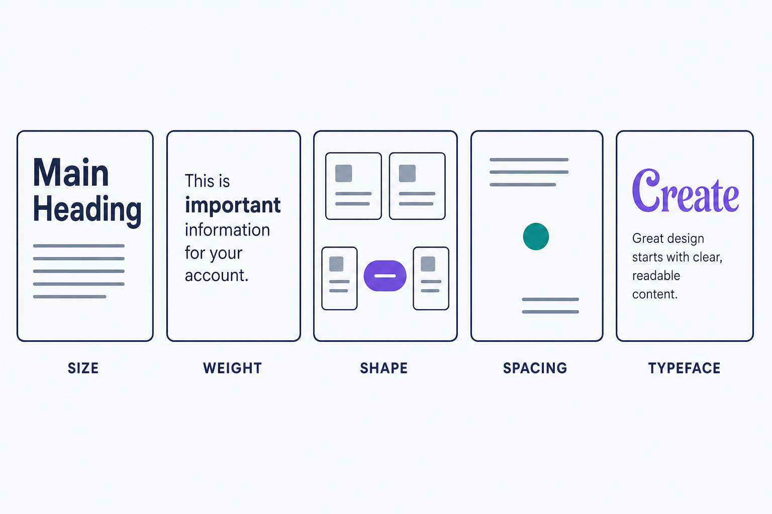
- Size: large headings above smaller body text signal what matters most.
- Weight: a bold word stands out from regular text at the same size.
- Shape: one rounded button among rectangular cards draws the eye.
- Spacing: white space around an element sets it apart without adding a single pixel of decoration.
- Typeface: pairing a decorative display font with a plain body font is classic typographic contrast.
WCAG contrast ratios
WCAG 2 measures contrast as the brightness difference between two colors, on a scale from 1:1 (white on white) to 21:1 (black on white). Level AA, the standard most sites target, requires:
- At least 4.5:1 for normal text against its background (SC 1.4.3).
- At least 3:1 for large text, meaning 24px and up, or bold text at about 18.7px.
- At least 3:1 for user interface components and meaningful graphics, such as form field borders and chart lines (SC 1.4.11).
Level AAA (SC 1.4.6) raises the text thresholds to 7:1 and 4.5:1. The numbers are exact. Gray #767676 on white passes AA at exactly 4.5:1, while the slightly lighter #777777 fails at 4.47:1, because ratios never round up. WebAIM's contrast article walks through the full rules and their exemptions.
How to test your contrast
Enter your foreground and background hex values into WebAIM's Contrast Checker to test one color pair, or run your URL through WAVE to flag every low-contrast text element on a page at once. Chrome DevTools shows the same ratio in its color picker when you inspect a text element.
Three mistakes cause most failures:
- Light gray body text on a white background. Darken the gray until the checker reports at least 4.5:1.
- Text placed over a busy photo. Add a dark overlay or a solid panel between the image and the words.
- Links styled with color alone. WCAG asks for a second cue (SC 1.4.1), so underline them.
Test your palette before launch, not after a complaint. Check the ratios once, and every page built on that palette inherits the fix.
Frequently Asked Questions
- No. WCAG 2 exempts logotypes (text in a logo or brand name) and purely decorative or incidental text, like book titles in a background photo or a grayed-out disabled button. Everything a visitor is meant to read must meet the minimum ratio.
- Level AA requires 4.5:1 for normal text and 3:1 for large text; Level AAA raises those to 7:1 and 4.5:1. Aim for AA as your baseline. AAA is worth the stricter palette for long-form reading or audiences with low vision.
- No. The thresholds are hard cutoffs, so 4.47:1 fails Level AA even though it rounds to 4.5. If a pair falls just short, nudge the text darker or the background lighter until a checker reports 4.5:1 or better.
- No. The ratio measures the brightness difference between two colors, so white text on black scores the same 21:1 as black text on white. You can invert a palette for dark mode without changing its compliance.
Custom Website Design
Get a one-of-a-kind, mobile-friendly website that makes your brand truly shine. Share your vision with us and we'll take it from there.
Custom Web Design