What Is Visual Balance?
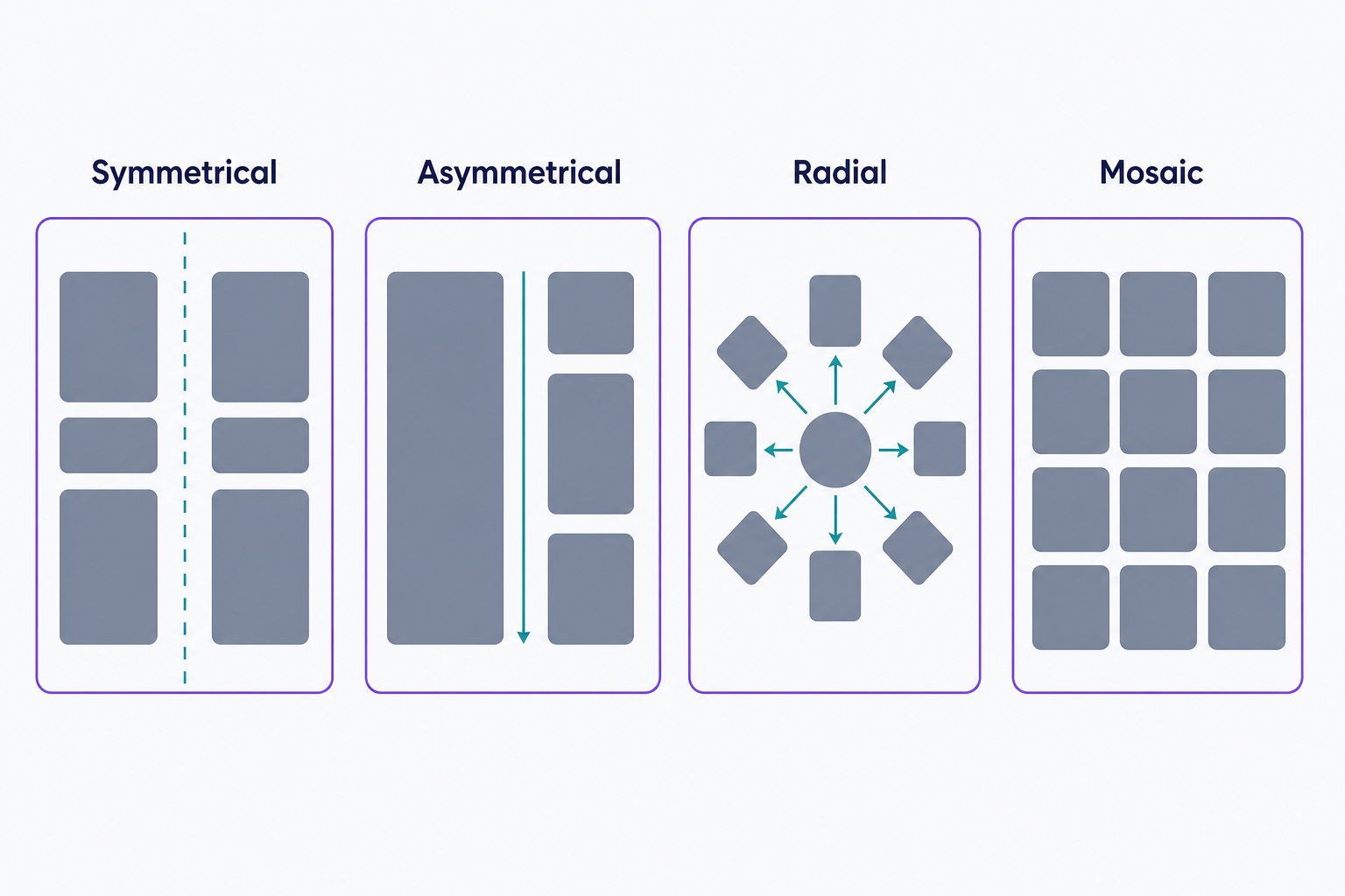
Visual balance is the distribution of visual weight (the pull elements exert on the eye through their size, color, contrast, and position) across a design so no single area overpowers the rest. Designers achieve it through symmetrical, asymmetrical, radial, or mosaic arrangements, and a balanced layout feels stable and easy to scan.
More About Visual Balance
A visually balanced website creates a positive user experience and can help fuel conversions: when no single region of the page overpowers the rest, visitors take in your whole message instead of getting stuck on one heavy corner. Designers group balance into 4 main types.
The 4 types of visual balance
- Symmetrical balance mirrors both sides of a central axis, creating a stable, evenly distributed page. On the web, that usually means a centered layout with matching columns. It's a natural fit for banks, law firms, and other sites that want to signal formality and trust.
- Asymmetrical balance, also called informal balance, uses dissimilar elements, differing in size, shape, tone, or placement, arranged so their visual weights still equalize. The classic web example is a hero section that balances a large image on one side against a headline and call-to-action (CTA) button on the other.
- Radial balance arranges elements around a single central point, often the center of the screen, so they radiate outward like spokes on a wheel. The center becomes the design's natural focal point: think of a centered logo with features orbiting it.
- Mosaic (crystallographic) balance spreads many elements of roughly equal visual weight across the space, with no single focal point. A Pinterest-style grid of image tiles is the classic web example.
How visual weight works
Every element on a page pulls the eye toward itself, and designers call that pull visual weight. Balance works like a seesaw: a heavy element close to the center can balance a lighter one placed farther out. Smashing Magazine's design-principles series (Steven Bradley, December 2014) lists what makes an element heavier: size (bigger weighs more), color (warm colors like red weigh more than cool ones), value (dark beats light), texture (textured beats flat), and position (the farther an element sits from the center, the more leverage its weight carries). There's no formula for any of this; you judge balance by eye. Empty areas count too. White space carries weight of its own, which is why generous margins can offset a dense block of content.
Choosing between symmetry and asymmetry
Pick the mood first, then the balance type. Symmetry reads as stable, formal, and trustworthy, and it's the easier of the two to build, but it can feel static. Asymmetry reads as energetic and modern, and it's better at steering the eye toward one focal point, such as a CTA button, which is why so many hero sections pair a big image with a headline-and-button block. The trade-off is difficulty: with asymmetry you're equalizing weights by judgment instead of by mirroring, so expect more iteration to get it right.
How to check (and fix) an unbalanced page
Run 2 quick tests. Squint at the page (or blur a screenshot) and note where your eye lands first; if one region swallows all the attention, that side is too heavy. Then flip the layout horizontally, because a mirrored view exposes lopsidedness your eye has learned to ignore. Imbalance has a real cost: the individual elements dominate the whole, the composition feels tense, and the eye gets pulled away from your message and your CTA. To fix a heavy side, add white space around it, shrink or lighten the dominant element, or move heavy elements toward the center, where their weight has less leverage.
Visual balance vs. visual hierarchy
Balance and hierarchy are companion principles, and a good layout needs both:
- Visual balance distributes weight so no area of the page overpowers the rest. It keeps the layout stable.
- Visual hierarchy deliberately ranks elements so some get seen first. It tells the eye where to start.
A page can be perfectly balanced and still confusing if nothing stands out. Set your hierarchy first, then balance the weight around it. Balance is only part of the toolkit; for the rest, including color, typography, and navigation, see our guide to the top 7 basic elements of web design.
Frequently Asked Questions
- Yes. An unbalanced composition creates tension, and sometimes that tension is the message, which is why expressive and creative sites occasionally break balance on purpose. It has to read as deliberate, though. Accidental imbalance just looks like a mistake and pulls attention away from your content.
- Asymmetrical balance. It's more versatile than strict symmetry, so it shows up far more often on the web. A typical example is a two-column layout where a wide, light content column is offset by a narrower, darker sidebar that stands out through contrast or a border.
- Yes. Dividing a layout into a 3x3 grid and placing key elements along the lines gives you off-center positions that still feel balanced. It's a practical starting point for asymmetrical layouts, where you'd otherwise judge visual weight entirely by eye.
Custom Website Design
Get a one-of-a-kind, mobile-friendly website that makes your brand truly shine. Share your vision with us and we'll take it from there.
Custom Web Design