What Is Responsive Design?
Responsive design is a web design approach in which one website adapts its layout and content to different screen sizes. It typically uses flexible CSS layouts, responsive media, and rules such as media or container queries, so the same pages stay readable and usable from phone to desktop without a separate mobile site.
More About Responsive Design
Responsive design is now the baseline for the web, not a trend to watch. Mobile devices generate 52.57% of worldwide web traffic, versus 45.93% for desktop (StatCounter, July 2026), and 96.2% of internet users go online by phone at least some of the time (DataReportal, April 2026).
Search engines follow that audience. Google uses the mobile version of a site's content for indexing and ranking, a practice called mobile-first indexing that finished rolling out in October 2023, and its documentation recommends responsive design as the way to build a mobile-friendly site. Mobile usability still counts in rankings, too. Google's page experience documentation (checked August 2026) says its core ranking systems look to reward content that offers a good page experience, and one of its self-assessment questions is whether your content displays well on mobile devices. If your pages only work on a desktop screen, both visitors and search engines will notice.
How responsive design works
Responsive design typically combines three techniques:
- A fluid grid: rows and columns sized in percentages rather than fixed pixels, so the layout stretches or shrinks with the browser window.
- Flexible images: images that scale with the column that contains them instead of keeping a fixed width, so they never spill off a small screen.
- CSS media queries: style rules that take effect once the screen crosses a set width, called a breakpoint.
These are common techniques, not requirements. Flexible layouts built with CSS Grid or Flexbox, responsive image features, and newer container queries, which apply style rules based on a container's width rather than the screen's, do the same job.
For example, a media query can show three columns side by side on a desktop monitor, then stack them into a single column when the browser window is narrower than a chosen breakpoint, such as 768 pixels. The content stays the same; only the layout changes. That keeps every page readable and usable on any screen, instead of forcing phone visitors to pinch, zoom, and scroll through a desktop layout.
Responsive design without writing CSS
Most site owners never write a media query. If your site runs on WordPress or a site builder, responsiveness comes from your theme or the builder's templates: nearly every actively maintained WordPress theme is a responsive theme out of the box, including every default theme since Twenty Twelve in 2012. Verify it rather than assume it. Preview a theme's demo at phone and tablet widths before committing, and retest after heavy customization, since one fixed-width embed can break an otherwise responsive layout. Our guide to choosing a WordPress theme covers what else to look for.
Responsive vs. adaptive design
Responsive and adaptive design solve the same problem in different ways, per the Interaction Design Foundation:
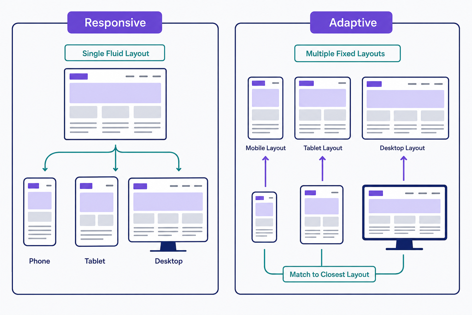
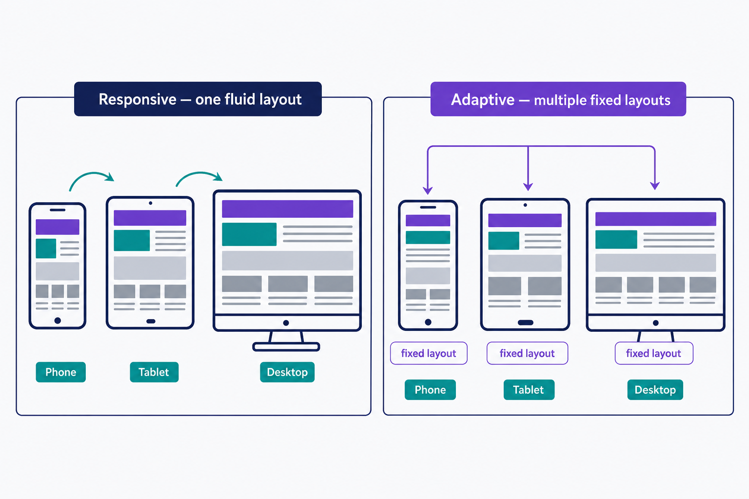
- Responsive design: one fluid layout that continuously adjusts to any browser width using media queries. There is a single layout to build and maintain.
- Adaptive design: several fixed layouts, commonly built at six widths (320, 480, 760, 960, 1200, and 1600 pixels). The site detects the screen and serves the closest fit.
The decision rule is simple. Responsive is less work and the default for new builds. Adaptive suits retrofits, where an existing desktop site needs a mobile experience with per-device control over each layout.
Responsive has trade-offs of its own. Every device receives the same HTML, so a phone can end up downloading desktop-weight images and scripts unless the site serves smaller files with responsive image markup, the srcset and sizes attributes. And because one layout serves everyone, tailoring the experience for a specific device is harder than with adaptive's separate layouts.
Common responsive design mistakes
Start by checking four common responsive design failures:
- A missing viewport meta tag. Without
<meta name="viewport" content="width=device-width, initial-scale=1">in the page head, mobile browsers render the page at a desktop width of about 980px, so no media query fires and the whole layout loads zoomed out. The fix is adding that one line. WordPress themes include it, so this mainly bites hand-coded pages. - Fixed-width elements. A container, embed, or ad set to a pixel width overflows small screens and forces horizontal scrolling. Size widths in percentages, or give them a maximum instead of a fixed value.
- Images that don't scale. An image with hard-coded dimensions spills out of its column on a phone. Let images resize with their container.
- Testing on one device. A layout that looks right on your own phone can lose its visual hierarchy elsewhere; responsive projects need testing across many screen widths.
A quick first check: narrow your browser window and watch whether the layout reflows cleanly. If it doesn't, our guide to optimizing your site for mobile walks through the fixes step by step.
Frequently Asked Questions
- No. Mobile-friendly means a site works well on phones by any method, including a separate m. subdomain or an adaptive layout. Responsive design is one specific technique: a single fluid layout, served at the same URL, that adjusts itself to every screen size.
- Open your browser's device-emulation mode, like Chrome DevTools' device toolbar, and preview your pages at phone and tablet widths. Dragging the browser window narrower also shows whether content reflows without horizontal scrolling. Broken layouts show you exactly where to start.
- Web designer Ethan Marcotte coined the term in his May 2010 article "Responsive Web Design," published by A List Apart, and later expanded the idea into a book of the same name. The article demonstrated a fluid grid and flexible images adapting a page to different screen widths.
Custom Website Design
Get a one-of-a-kind, mobile-friendly website that makes your brand truly shine. Share your vision with us and we'll take it from there.
Custom Web Design