What Is a Breakpoint in Web Design?
A breakpoint is a viewport width at which a responsive website’s layout changes to keep its content usable and readable. Breakpoints are set with CSS media queries: for example, a site might switch from a 3-column desktop layout to a single column below 768px, so one design adapts to phones, tablets, and desktops.
More about breakpoints
Breakpoints are the working parts of responsive design. Set a few well-chosen ones and the same page stays readable on everything from a phone to a widescreen monitor.
A mobile-first approach uses base styles for small screens, then adds min-width media queries at each breakpoint for the larger layouts. You start with a simple small-screen design and enrich it as the screen gets wider.
How breakpoints work in CSS
A breakpoint is where a CSS media query takes effect. As MDN's responsive design documentation puts it, the points at which a media query is introduced are known as breakpoints. Your stylesheet applies one set of layout rules by default, and the media query swaps in different rules once the viewport, the visible area of the browser window, crosses the width you chose.
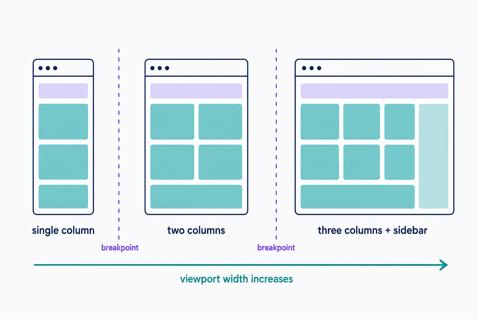
For example, @media (min-width: 768px) { … } applies its rules only when the viewport is at least 768px wide. You might use it to switch a single-column phone layout to a 2-column tablet layout. A min-width query builds up from small screens (mobile-first), while a max-width query works down from the desktop design (desktop-first). Bootstrap builds its entire grid mobile-first with min-width queries.
Common breakpoint values
No official standard exists; no spec says where a breakpoint must go. Two widely used reference points:
- Nielsen Norman Group (April 2024) describes 4 common ranges: extra-small, up to about 500px (phones); small, 500px to 1200px (tablets); medium, 1200px to 1400px (laptops); and large, 1400px and up (big external monitors).
- Bootstrap 5.3 ships 6 defaults: a base layout below 576px, then min-widths of 576px (sm), 768px (md), 992px (lg), 1200px (xl), and 1400px (xxl).
Treat these as starting points. Your content should set the final values, not someone else's device chart.
Choosing your breakpoints
Set breakpoints where your content starts to break, not at fixed device widths. Resize your browser from narrow to wide and watch for the moment lines run too long, columns squash together, or the navigation crowds itself; that's where a breakpoint belongs. MDN recommends this content-driven approach because device-targeted breakpoints go stale every time new screen sizes ship. In practice, Nielsen Norman Group reports that designers usually accommodate only 2 or 3 breakpoints.
A few habits keep them manageable:
- Know what usually changes at a breakpoint: navigation collapses under a hamburger icon, sidebars fold into the main column, and rows show fewer cards or products.
- Keep values consistent across the whole site so components don't shift at slightly different widths.
- Test at widths between your breakpoints, not just at them; that's where squashed layouts hide.
- Check real phones and tablets too, not just a resized desktop window.
Frequently Asked Questions
- A media query is the CSS rule that tests viewport conditions, such as @media (min-width: 768px). A breakpoint is the specific width value at which you introduce one. Not every media query contains a breakpoint: a preference query like @media (prefers-reduced-motion: reduce) has no width threshold.
- No. In software development, a breakpoint is a marker where a debugger pauses code execution so you can inspect what's happening. In web design, it's a viewport width where a responsive layout changes. Same word, unrelated jobs.
- Both usages are common. Technically, a breakpoint is the single width value where the layout changes. In practice, designers often use the word for the whole screen-size range that displays one layout, since a range is what they specify in media queries.
Custom Website Design
Get a one-of-a-kind, mobile-friendly website that makes your brand truly shine. Share your vision with us and we'll take it from there.
Custom Web Design