What is a Responsive Theme?
A responsive theme is a website theme designed to adjust its layout and content presentation across screen sizes, usually with fluid grids, flexible media, and CSS media queries. In WordPress, it lets one site serve phones, tablets, and desktops without a separate mobile theme, though responsive design alone doesn’t guarantee good usability or performance.
More About Responsive Themes
Responsive themes use flexible layouts, scalable images, and CSS media queries so one design can adapt to any screen size, from a phone to a widescreen desktop monitor. Many are built mobile-first (designed for small screens first, then enhanced for larger ones), but mobile-first is one strategy for achieving responsiveness, not a synonym for it.
Mobile devices generate 51.47% of worldwide web traffic, per Statcounter (June 2026), slightly ahead of desktop’s 47.17%. Google also evaluates the mobile version of your content when indexing and ranking pages, a practice called mobile-first indexing. So a theme that breaks on phones frustrates about half your visitors and costs you engagement, and the broken mobile version is the one Google reads when it evaluates your WordPress website. That’s not an automatic sitewide ranking penalty, but it does mean the mobile experience is the one that counts.
Most modern WordPress themes are responsive. Every default theme since Twenty Twelve (2012), the first fully responsive default, has shipped responsive out of the box. As of July 2026, the current default is still Twenty Twenty-Five: WordPress 6.9 (December 2025) skipped a new default theme, and the core team has scheduled Twenty Twenty-Seven for WordPress 7.2 in early December 2026. If your theme is older or heavily customized, don’t assume: test it.
Responsive theme mechanics
A responsive theme serves one HTML layout at one URL and lets CSS handle the adapting. Media queries apply different style rules at set breakpoints (collapsing a 3-column desktop grid into a single phone column, for example), while fluid grids and flexible images scale smoothly in between. The technique comes from responsive web design, and that entry covers the mechanics in more depth.
Responsive vs. adaptive vs. separate mobile sites
Google Search Central names 3 ways to serve mobile visitors, and it recommends responsive design:
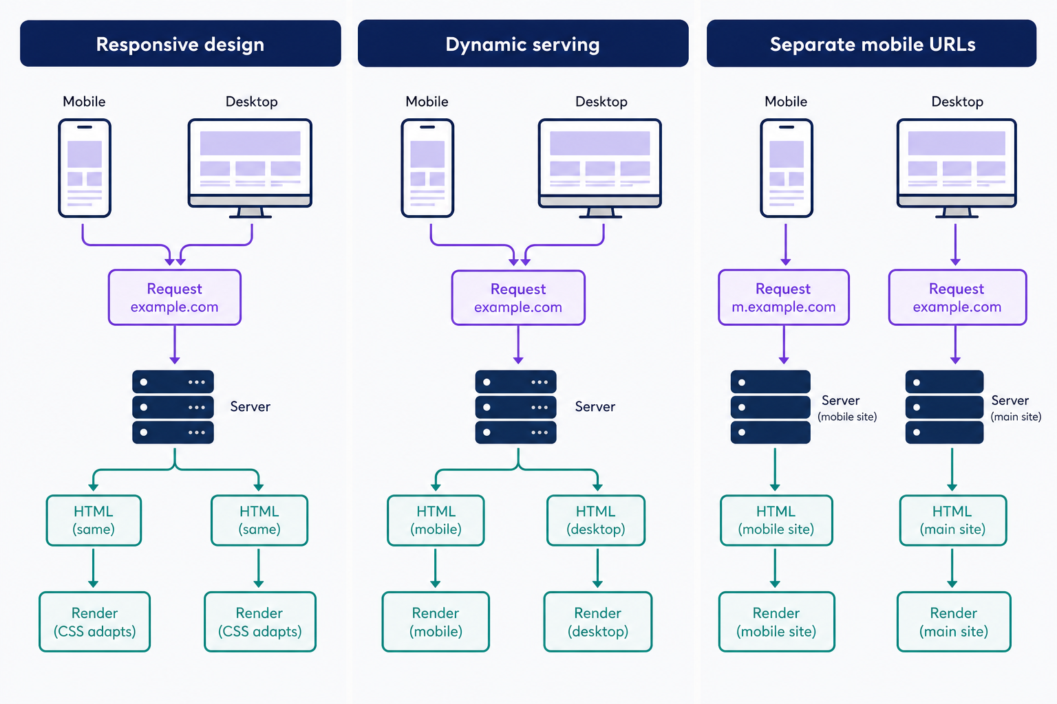
- Responsive design: one layout and the same HTML served on one URL, adjusting fluidly with media queries. This is what a responsive theme gives you.
- Dynamic serving (adaptive): the server detects the device and sends a different version of the page to each device class.
- Separate mobile URLs: a second site at an address like m.example.com, maintained in parallel with the desktop site.
For WordPress, the decision is settled: pick a responsive theme. Dynamic serving and separate mobile URLs are legacy patterns that leave you building, testing, and debugging every page twice.
How to check whether your theme is responsive
Testing takes about 5 minutes:
- Resize your browser window. Text should reflow and images should shrink; a horizontal scrollbar means the layout isn’t adapting.
- Open your browser’s device toolbar (in Chrome, press Ctrl + Shift + M on Windows or Cmd + Shift + M on Mac) and preview common phone and tablet widths.
- For a theme you haven’t activated yet, use the WordPress theme preview or the Site Editor’s tablet and mobile views.
- Confirm on a real phone. Emulators miss touch problems, like tap targets placed too close together.
If the layout fails, match the fix to the damage. An isolated defect, like one overflowing image or tap targets packed too close together, is usually cheap to repair with a few lines of child-theme CSS. A theme that’s fixed-width at its core, or one its developer no longer updates, is worth replacing; a responsive block theme is a strong option, though any well-built responsive theme works. Before you switch, preview the replacement on a staging copy of your site, check that your menus, widgets, and plugin-generated content still render, and take a full backup before activating.
Frequently Asked Questions
- No. Responsiveness is a baseline expectation, not a premium feature: free themes, including the WordPress defaults, are responsive. Paid themes charge for extras like niche layouts and support, not for mobile compatibility. If a theme sells mobile support as an upgrade, treat that as a red flag.
- No, not by itself. A responsive theme serves the same HTML to every device, so responsiveness adds no meaningful page weight. Slow themes are slow for other reasons, usually heavy scripts and oversized images, so judge a theme’s performance separately from its responsiveness.
- Usually not. Mobile plugins such as WPtouch serve a separate mobile theme to phone visitors, the standard approach before responsive themes became the norm. Pairing one with a responsive theme leaves you maintaining 2 presentations of the same site. Reserve them for older, non-responsive themes you can’t replace yet.
Powerful WordPress Hosting
Reliable, lightning-fast hosting solutions specifically optimized for WordPress. Find the perfect plan for you by clicking below.
WordPress Hosting Plans